My Understanding of Flexbox Layout Mode
Categories: Study
Flexbox, a CSS3 layout mode, also known as the flexible box model, is used to provide maximum flexibility for the box model.
First, let’s take an example. Before, we implemented horizontal and vertical centering of a div box like this. Knowing the height and width of the object, position the centered element with absolute percentage, and then use margin offset to achieve it.
<style>
    .container{
        width: 600px;
        height: 400px;
        border: 1px solid #000;
        position: relative;
    }
    .box{
        width: 200px;
        height: 100px;
        border: 1px solid #000;
        position: absolute;
        left: 50%;
        top: 50%;
        margin-left: -100px;
        margin-top:-50px;
    }
</style>
<div class="container">
    <div class="box"></div>
</div>
If you use flex, the implementation is simple, and you don’t need to calculate it yourself, nor do you need absolute positioning. You only need to define two attributes for the flex container. justify-content defines the alignment of flex items along the main axis as center, and align-items defines the alignment of flex items on the cross axis (perpendicular to the main axis) as center. The details are as follows:
<style>
 .container{
     width: 600px;
     height: 400px;
     border: 1px solid #000;
     display: flex;
     justify-content:center;
     align-items:center;

 }
 .box{
     width: 200px;  //Width can be arbitrary
     height: 100px; //Height can be arbitrary
     border: 1px solid #000;

 }
</style>
<div class="container">
    <div class="box"></div>
</div>
In fact, the excellent features of Flexbox are not just these. First, let’s have a property map of it~
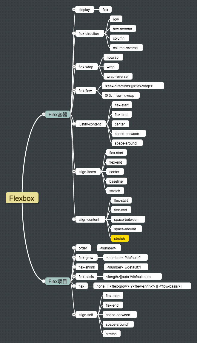
First, let’s analyze this picture. From the first child node, we can see that Flexbox consists of Flex Container and Flex Item. The container is the parent element, and the item is the child element. Some relationships between them can be represented like this:

This picture can be used in the following property analysis.
Flex Container
display:flex
When we use flexbox layout, we need to set the display value of the parent container to flex (block level) or inline-flex (inline level).
After using this value, the flex container will establish a new flex formatting context (FFC) for the content. Its context display effect is the same as the BFC root element (BFC feature: floats will not intrude into the flex container, and the boundaries of the flex container will not overlap with its content boundaries).
Flex containers are not block containers, so some properties designed to control block layout are not applicable in flex layout, especially multi-column (column), float, clear, vertical-align properties.
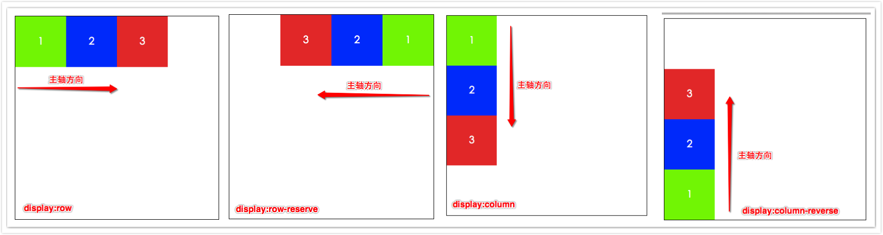
flex-direction
The [flex-direction] property is used to control the direction of the main axis in the flex container in the figure above, and also determines the direction of the flex items.
- flex-direction:row; is also the default value, that is, the direction of the main axis is the same as the normal direction, arranged from left to right.
- flex-direction:row-reverse; opposite to the direction of row, arranged from right to left.
- flex-direction:column; arranged from top to bottom.
- flex-direction:column-reverse; arranged from bottom to top. The above is only for ltr writing mode, and it is exactly the opposite for rtl.
The web page display effect is as follows:
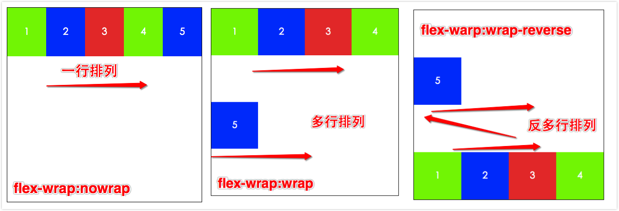
flex-warp
The [flex-wrap] property controls whether the flex container is single-line or multi-line, and also determines the cross-axis direction (stacking direction of the new line).
- flex-wrap:nowrap; the flex container is displayed in a single line, default value;
- flex-wrap:wrap; the flex container is displayed in multiple lines; the arrangement order of flex items in each line is from top to bottom.
- flex-wrap:wrap-reverse; the flex container is displayed in multiple lines, but the arrangement order of flex items in each line is from bottom to top.
See the picture for web page effect;
flex-flow
The [flex-flow] property is a shorthand for flex-direction (main axis direction) and flex-wrap (cross axis direction). The two properties determine the main axis and cross axis of the flex container.
- flex-flow:[flex-direction][flex-wrap]; default value is row nowrap;
Give two examples:
- flex-flow:row; is also the default value; the main axis is the inline direction, displayed in a single line, without wrapping;
- flex-flow:row-reverse wrap; the main axis is opposite to the inline direction, from right to left, and the items in each line are arranged from top to bottom (cross axis).
The web page effect is as follows:
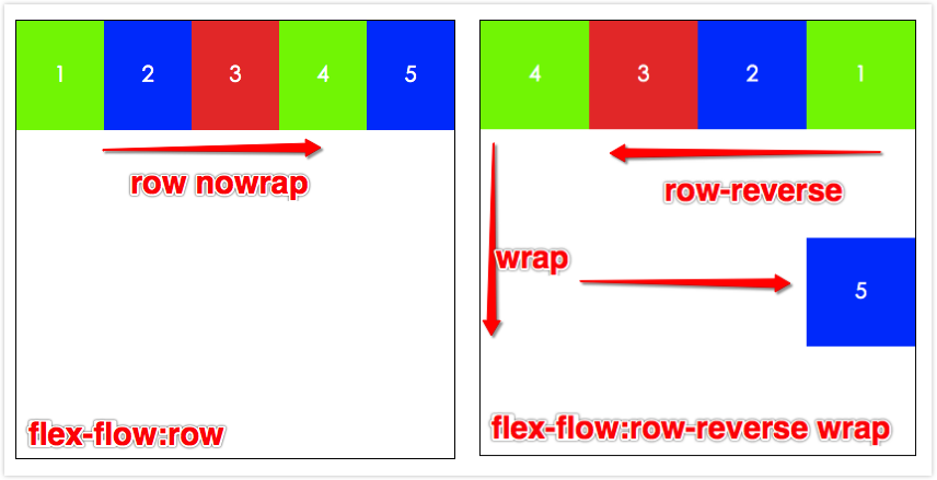
Here you can try different combinations yourself.
justify-content
[justify-content] is used to define the alignment of flex items on the main axis. This property distributes extra space when all flex items on a line cannot be stretched or are stretchable but have reached their maximum length. When items overflow a line, this property also exerts some control on the alignment of items.
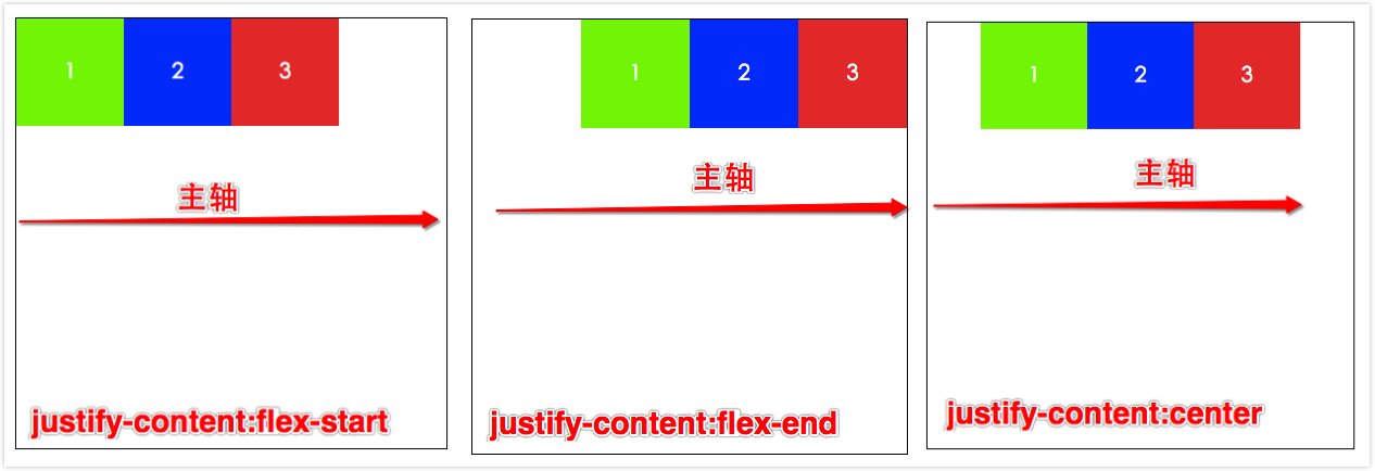
- justify-content:flex-start; flex items are aligned starting from the start position of the main axis, and each subsequent element is aligned next to the previous element.
- justify-content:flex-end; flex items are aligned to the end position of the main axis, and each preceding element is aligned next to the latter element.
- justify-content:center; flex items are aligned with each other and centered on the main axis, and the distance from the first element to the start point of the main axis is equal to the position of the last element to the end point of the main axis. The above 3 are “bundled” in a left, right, and center alignment respectively.
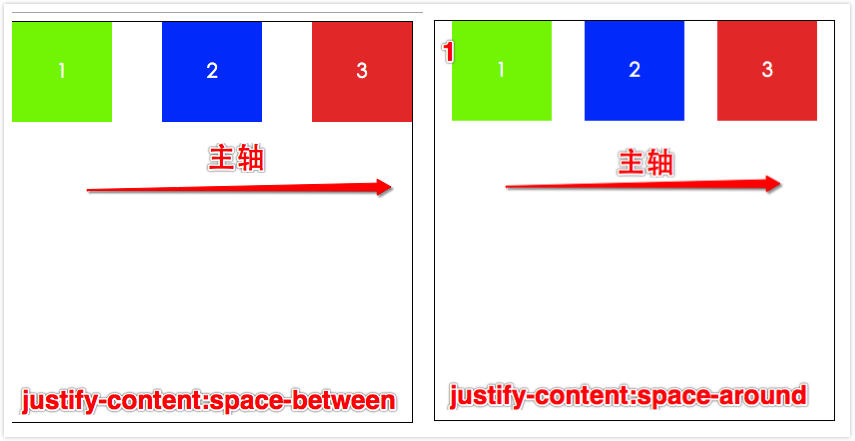
- justify-content:space-between; flex items are evenly distributed on the main axis, and the first element is close to the start point of the main axis, the last element is close to the end point of the main axis, and the remaining flex items in the middle are evenly divided ensuring equal intervals between two items.
- justify-content:space-around; flex items are evenly distributed on the main axis, and the distance from the first element to the start point of the main axis and the distance from the last element to the end point of the main axis are equal, and equal to half of the distance between two intermediate elements. Perfect even distribution, this layout is very common in large-scale applications.
Let’s look at the demo to understand faster:
align-items
[align-items] is used to define the alignment of flex items on the cross axis. This is similar to the [justify-content] property, but in another direction. (flex-directon and flex-wrap are a pair, justify-content and align-items are a pair. The former define the direction of the main axis and cross axis respectively, and the latter define the alignment mode of items in the main axis and cross axis respectively).
- align-items:flex-start; the outer margin of the flex item on the cross axis start edge is close to the edge of the line at the cross axis start point.
- align-items:flex-end; the outer margin of the flex item on the cross axis end edge is close to the edge of the line at the cross axis end point.
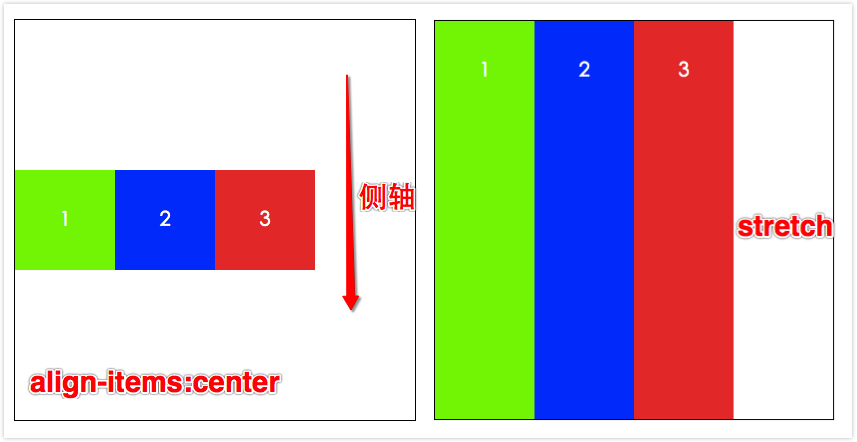
- align-items:center; the outer margin of the flex item is centered on the cross axis.
- align-items:baseline; if the inline axis of the flex item is the same as the cross axis, this value is equivalent to [flex-start]. In other cases, this value will participate in baseline alignment.
- align-items:stretch; flex items stretch to fill the entire flex container. This value will make the size of the item’s margin box as close as possible to the size of the line where it is located, subject to the restrictions of the “min/max-width/height” property.
The demo below only shows examples of center and stretch. The others can refer to flex-start and flex-end.
align-content
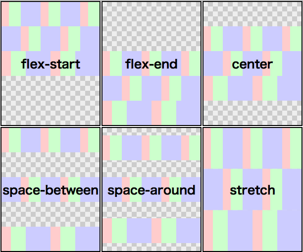
The [align-content] property can be used to adjust the alignment of flex lines in the flex container. This is similar to the [justify-content] property that adjusts the alignment of flex items on the main axis. Except here the element is in units of one line. Please note that this property has no effect on a flex container with only one line. When using flex-wrap:wrap, the multi-line effect comes out.
align-content: flex-start || flex-end || center || space-between || space-around || stretch;- align-content: stretch; default value, each line will stretch to occupy the remaining space.
- Others can refer to [justify-content] usage.
Specific pictures come from w3.org official documentation;
Too troublesome. Can’t write anymore, drop.
Flex Item
Finally wrote about the relevant properties of flex items, mainly 3, order, flex (combination of flex-grow, flex-shrink, flex-basis), align-self; the first two are used more.
order
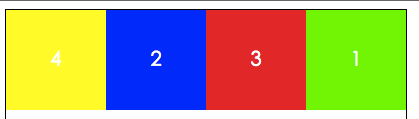
There is a usage that is used more often. If you want to set two elements in a group, one ranked first and the other ranked last, you mainly need to set the order of the first one to -1; the other to order:0; that’s it.
For example, we want to control 4 boxes in a container, want box4 to be displayed first, and box1 to be displayed last. Just need like this
<style>
.container{
        display: flex;
    }
    .box1{
        order:1;
    }
    .box4{
        order:-1;
    }
</style>
<div class="container">
    <div class="box1">1</div>
    <div class="box2">2</div>
    <div class="box3">3</div>
    <div class="box4">4</div>
</div>
The display effect is like this:
flex
The [flex] property can be used to specify stretchable length components. It is a shorthand for flex-grow (expansion ratio), flow-shrink (shrinkage ratio), flex-basis (flex basis value) these three properties. It is recommended that you use the shorthand method instead of using these 3 properties separately.
flex:none | [ <'flex-grow'> ?<'flew-shrink'> || <'flow-basis'>]
// flex-grow is mandatory, flex-shrink and flow-basis are optional- flex-grow:
; where number is the expansion ratio, no unit, initial value is 0, mainly used to determine how much space the remaining space of the flex container should be expanded proportionally. - flex-grow:
; where number is the shrinkage ratio, no unit, initial value is 1, which means the proportion of space that this flex item can shrink relative to other flex items in the flex container when the remaining space is negative. When shrinking, the shrinkage ratio will be weighted by [flex-basis] flex basis value. - flex-basis:
|auto; default is auto, which is the starting value of the main axis length of the flex item before calculating the distribution of remaining space according to the flexible ratio. If this component is omitted in the "flex" abbreviation, the specified value of "flex-basis" is zero length.
flex-basis represented by a diagram looks like this:

align-self
[align-self] is used to overwrite the default alignment on individual flex items. This property is used to override the alignment of each line by the flex container property align-items. That is to say, in the default case, these two values are equal.
align-self: auto | flex-start | flex-end | center | baseline | stretchMy View
Having talked so much about their usage, let’s take a look at the compatibility of flexbox layout.
Specific details can be seen on this website: caniuse
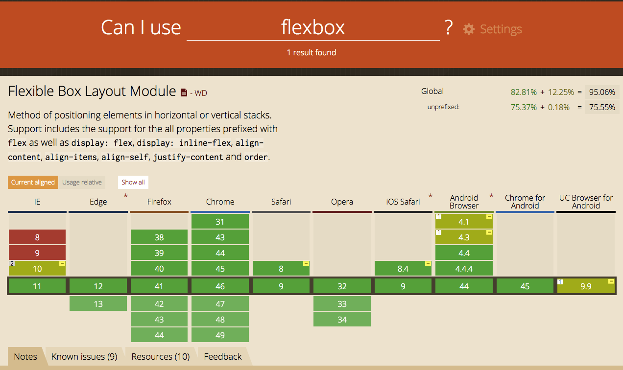
It is actually very optimistic on the PC side. Basically, mainstream browsers are already compatible with the use of flex. But it is not so good on the mobile side, especially domestic browsers. Considering that uc browser accounts for the majority, but uc only supports the oldest version of flex from the figure, that is, the 2009 version, display:box; many excellent features of flex now are incompatible on it. So it is recommended that when using it, if the 2009 version can meet the development requirements, still use the 2009 version, so the risk is smaller.
But if you want to be compatible with multiple browsers, you can use the method of graceful degradation. Here I recommend a scss sass-flex-mixin, so you can use the latest writing method and be compatible with most browsers.
I believe flexbox layout will be used more and more on the mobile side in the future.
Supplement a magical Flexbox playground
See the Pen Flexbox playground by Tw93 (@tw93) on CodePen.